Power BI is a powerful tool that helps you turn data into insightful reports. This guide will walk you through the steps to master Power BI, from connecting your data sources to sharing your reports. Whether you’re new to Power BI or looking to sharpen your skills, this guide has something for everyone.
Key Takeaways
- Learn how to connect and import data from various sources into Power BI.
- Understand the techniques for cleaning and transforming data to make it ready for analysis.
- Discover how to build a data model that optimizes your data for efficient analysis.
- Get to know DAX formulas to perform complex calculations and derive meaningful insights.
- Find out how to design interactive and visually appealing reports to share with others.
Connecting and Importing Data
Choosing Data Sources
When starting with Power BI, the first step is to choose the right data source. Power BI Desktop offers a variety of data sources to connect to, such as Excel, CSV, and databases. You can see the available data sources in Power BI Desktop and decide which one fits your needs.
Importing Data into Power BI
- Select “Get Data” from the Home tab.
- Choose the type of data source (e.g., Excel, CSV, Database) and provide connection details.
- Use the Power Query Editor to clean, transform, and shape the data.
- Click “Close & Apply” to load the data into Power BI.
Managing Data Connections
Managing data connections in Power BI is crucial for keeping your reports up-to-date. You can manage your data sources and connections through the Power BI settings. This includes updating connection details and refreshing data to ensure your reports reflect the latest information.
Remember, any future data sources and most future data transformations need to be integrated into the DirectQuery/Live source.
Cleaning and Transforming Data
Once the data is extracted, it is often necessary to clean and transform it. This process may involve handling missing values, correcting inconsistencies, and converting data types to ensure uniformity. Power BI’s Power Query Editor provides a user-friendly interface to perform these tasks efficiently. You can easily filter data, split columns, merge tables, and apply custom transformations to get your data in tip-top shape.
Building a Data Model
Creating a data model in Power BI is a crucial step for organizing your data to make it easy to analyze and visualize. A well-structured data model helps ensure your reports are accurate and insightful.
Writing Formulas with DAX
Understanding DAX Basics
DAX, short for Data Analysis Expressions, is the formula language of Power BI. It’s your secret weapon for creating custom calculations and metrics beyond the standard offerings. Think of it as a way to speak directly to your data and ask complex questions.
With DAX, you can easily calculate key financial ratios like profitability, liquidity, and solvency. Need to track year-over-year growth or perform time intelligence calculations?
Creating Measures and Calculated Columns
DAX (Data Analysis Expressions) is a robust expression language employed in Power BI to create measures and calculated columns. DAX expressions can address questions such as “how much” and “how many,” enabling complex calculations on your data. Mastering key DAX concepts like iterator functions, filter context, and the CALCULATE function is crucial for developing versatile and efficient Power BI reports.
Advanced DAX Functions
DAX has you covered. Want to segment your data by product line, region, or any other dimension? DAX can handle it.
Here are some powerful DAX functions that every financial analyst should have in their toolkit:
- CALCULATE: This versatile function allows you to modify the filter context of your calculations, enabling you to perform sophisticated analysis.
By deepening your understanding of these DAX concepts and applying them to your Power BI reports, you can create more sophisticated calculations and visualizations that provide meaningful insights to your users.
Designing Reports with Visuals
Creating effective reports in Power BI involves selecting the right visuals, customizing them, and making your dashboards interactive. Choosing the right visual is crucial for accurately representing your data and making it easy to understand. Some examples of visuals are: pie chart, line chart, map, and KPI.
Selecting Appropriate Visualizations
Choosing the right visual is the first step in designing a report. Different types of data require different visualization types in Power BI. For instance, use bar charts for comparing quantities, line charts for trends over time, and pie charts for showing parts of a whole.
Customizing Visuals
Once you’ve selected your visuals, it’s time to customize them. In the “View” tab, select “Themes” to apply predefined styles or create custom themes. Click on a visual to select it, and use the format pane on the right to customize colors, fonts, and other visual elements. Customize the report background and add borders if necessary.
Creating Interactive Dashboards
Interactive dashboards make your reports more engaging. Use features like slicers, drillthrough report pages, and bookmarks to allow users to interact with the data. Slicers help filter data, while drillthrough pages provide detailed insights. Bookmarks can save specific views of your report for easy access.
Remember, a well-designed report not only looks good but also makes data easy to understand and interact with.
Publishing and Sharing Reports
Publishing to Power BI Service
After crafting your Power BI report, the next step is sharing your insights. By publishing reports to the Power BI Service, users can easily share their work with colleagues or embed reports in websites for broader accessibility. Additionally, the Power BI Mobile app allows users and business users to access dashboards and reports on the go, empowering decision-makers with real-time insights from anywhere. This functionality underscores the collaborative nature of Power BI, making it a versatile tool for modern businesses.
To publish a Power BI Desktop semantic model and reports, in Power BI Desktop, choose File > Publish > Publish to Power BI or select Publish on the Home ribbon.
Sharing Reports with Stakeholders
Publishing a report or dashboard to the Power BI service makes it accessible to those you have granted permission to, who can access it via a shared link. Users can leave comments against visuals, enhancing collaboration.
Managing Report Permissions
It is important to understand that the Publish to Web feature does not provide any kind of security or authentication. Anyone that has the link to the report that has been published using the Publish to Web feature can access the report anonymously. There are many other features that cannot be used in the Power BI service as well, such as subscriptions and comments.
Advanced Reporting Techniques
Using Paginated Reports
Paginated reports in Power BI are ideal for creating documents that are meant to be printed or shared as PDFs. These reports are highly formatted and can span multiple pages. They are perfect for detailed financial statements, invoices, and other records that require a specific layout.
Implementing Row-Level Security
Row-Level Security (RLS) in Power BI allows you to control access to data at a granular level. By setting up RLS, you can ensure that users only see the data that is relevant to them. This is particularly useful in scenarios where sensitive information needs to be protected.
Performance Optimization Tips
Optimizing the performance of your Power BI reports is crucial for a smooth user experience. Here are some tips to enhance performance:
- Use aggregations to reduce the amount of data processed.
- Optimize your data model by removing unnecessary columns and tables.
- Implement query reduction techniques to minimize the number of queries sent to the data source.
- Use the Power BI Enhanced Report Format (PBIR) in Power BI Desktop to facilitate co-development and improve development efficiency.
Remember, a well-optimized report not only runs faster but also provides a better user experience.
Conclusion
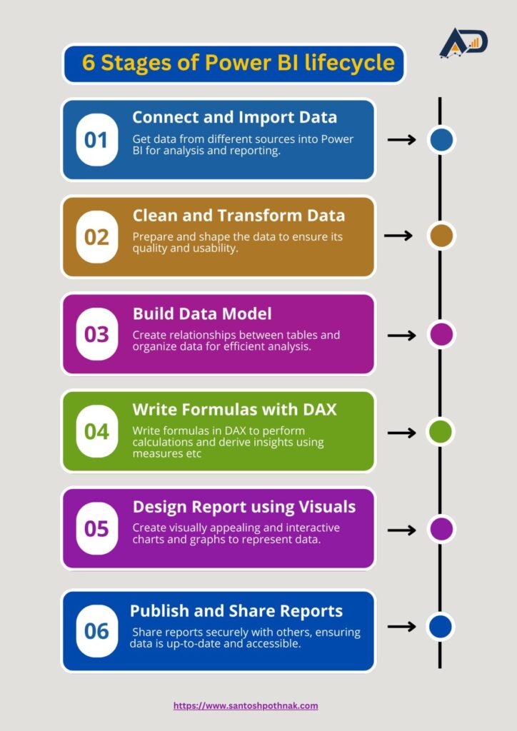
Mastering Power BI is a journey that starts with connecting and importing data, followed by cleaning and transforming it, building a data model, writing DAX formulas, and finally designing reports with visuals. This step-by-step guide aims to simplify the process, making it accessible for beginners and beneficial for advanced users. By following these steps, you can create powerful reports that provide valuable insights and help in making data-driven decisions. Keep practicing, and soon you’ll be able to harness the full potential of Power BI to transform raw data into meaningful stories.
Frequently Asked Questions
What is Power BI?
Power BI is a tool from Microsoft that helps you visualize and analyze data. It can connect to many data sources and create interactive reports and dashboards.
Do I need to know coding to use Power BI?
No, you don’t need to know coding to use Power BI. It has a user-friendly interface that allows you to drag and drop elements to create reports. However, knowing some basic coding can help you do more advanced tasks.
How do I import data into Power BI?
You can import data into Power BI by connecting to various data sources like Excel, SQL Server, and online services. You can find the ‘Get Data’ option on the Home tab to start importing data.
What is DAX in Power BI?
DAX stands for Data Analysis Expressions. It’s a formula language used in Power BI to create custom calculations and measures. It helps you perform advanced data analysis.
Can I share my Power BI reports with others?
Yes, you can share your Power BI reports with others. You can publish your reports to the Power BI Service and then share them with your team or stakeholders. You can also set permissions to control who can view or edit the reports.
Is Power BI free to use?
Power BI offers a free version with basic features. However, for more advanced features and sharing options, you may need a Pro or Premium subscription.


